
Thursday, December 17, 2015
Wednesday, December 9, 2015

Friday, November 20, 2015
selfie blog assignment


1. The feet one because my face is not in it. I'm just standing. The mood is rushed.
2. I did not use hacks because I'm all natural.
Wednesday, November 18, 2015
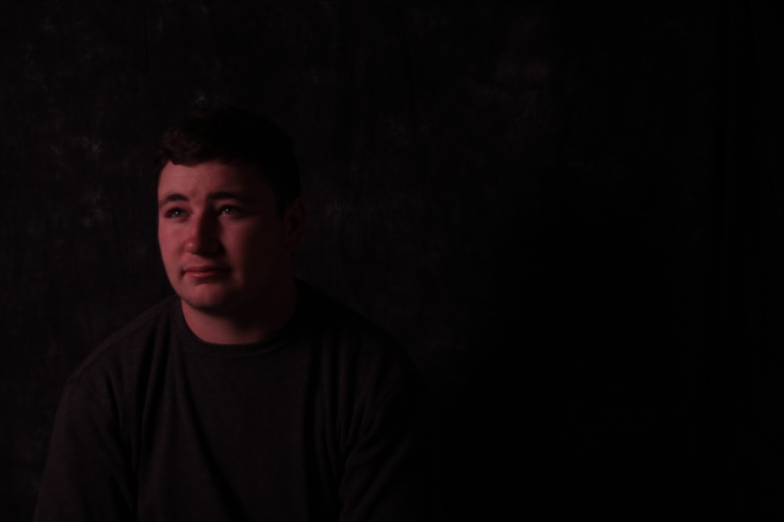
formal portraits


1. My favorite is the bottom picture because I did a great job editing.
2. The easiest part was taking the photos.
3. The hardest part was editing.

Monday, November 16, 2015


Monday, November 9, 2015
portraits


1. I think that asymmetrical balance was the most effective because it added effect to the shot.
2. The rule of thirds was the worst balance. In every shot that I used the rule of thirds I had to delete the photo.
Tuesday, October 27, 2015
writing with light
group members: Austin Strehlow, Holland Seropian, Brandon Fowler, Michael Jaber

Painting with light

writing and painting with light

writing with light

light up face

Monday, October 19, 2015


Wednesday, October 7, 2015


Tuesday, September 29, 2015

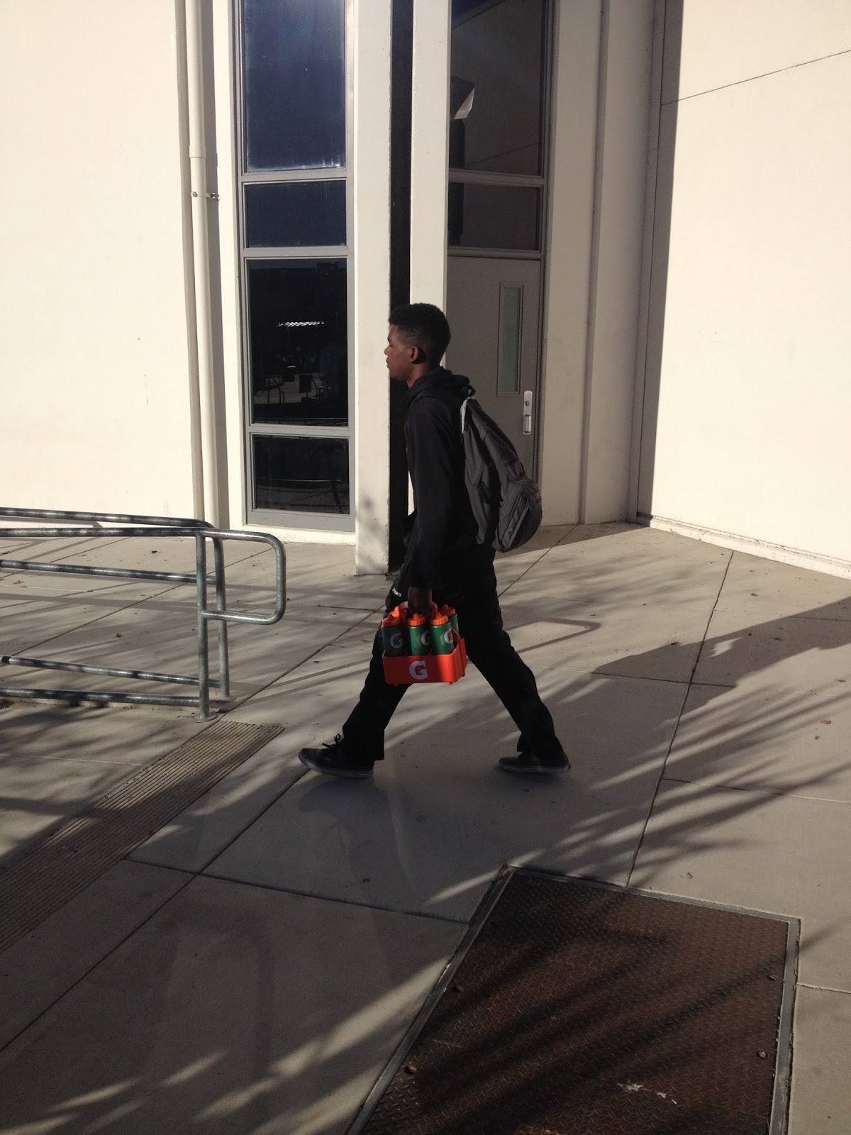
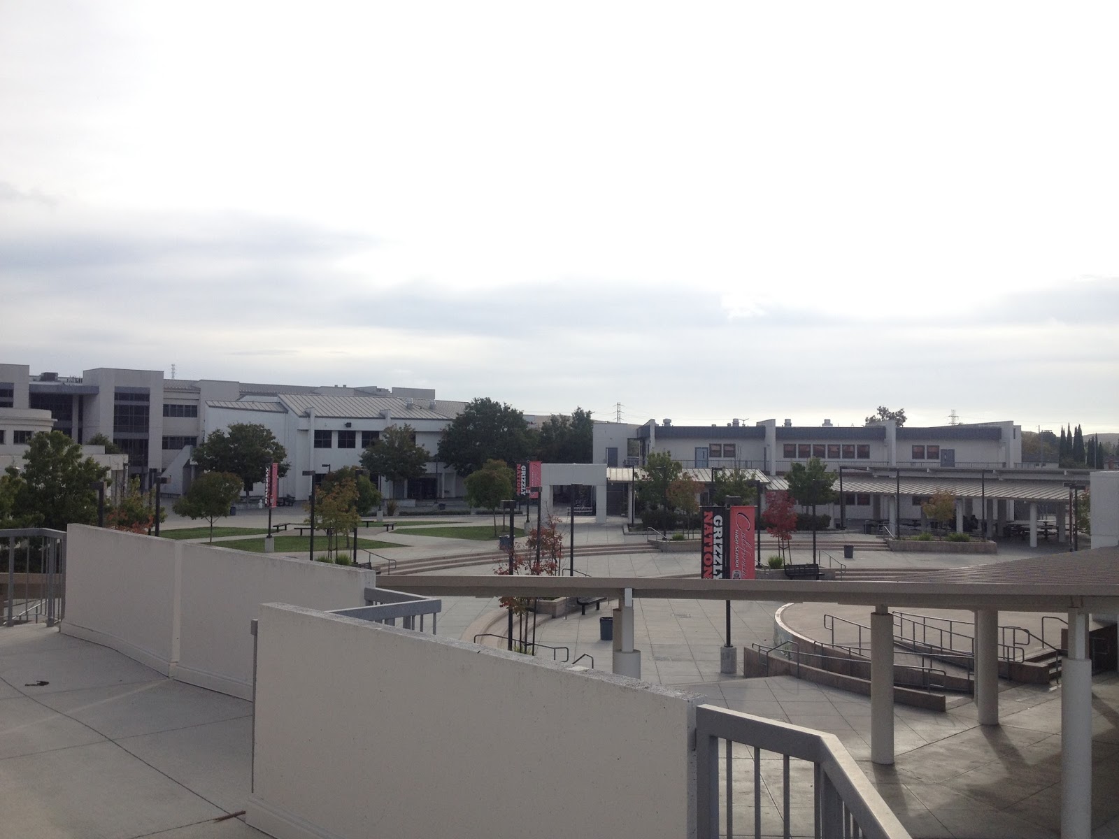
photo scavenger hunt

A three year old looking at a refrigerator.
An ant looking at food.

A bird looking at the ground.
A photo at 9 am.

Lonliness.

A building.
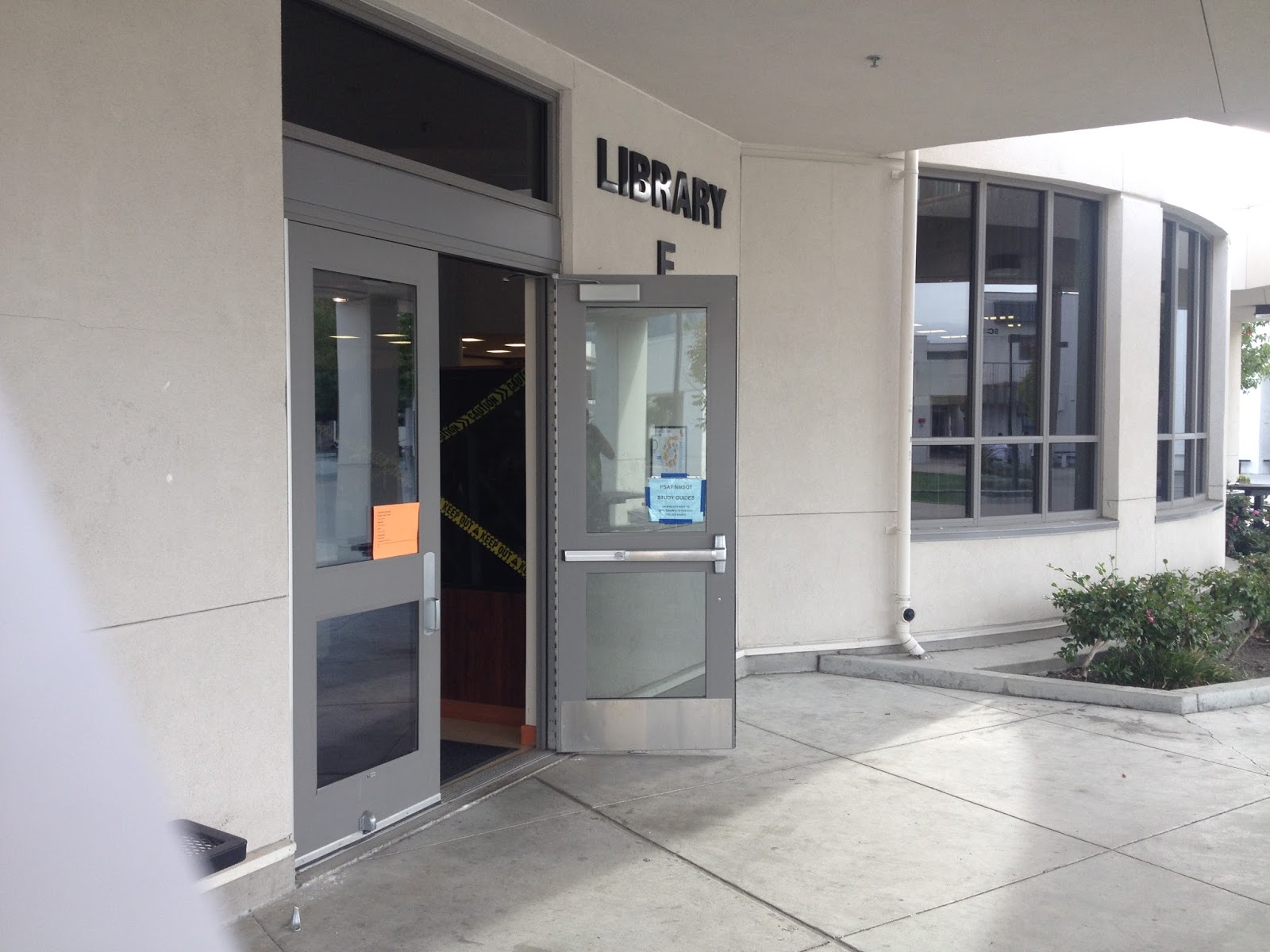
A part of a building.

A door handle.

Excitement.

Someone who stands out in a crowd.

A person with a plain background.

Something shiny.

A moving vehicle with a plain background.
Thursday, September 17, 2015
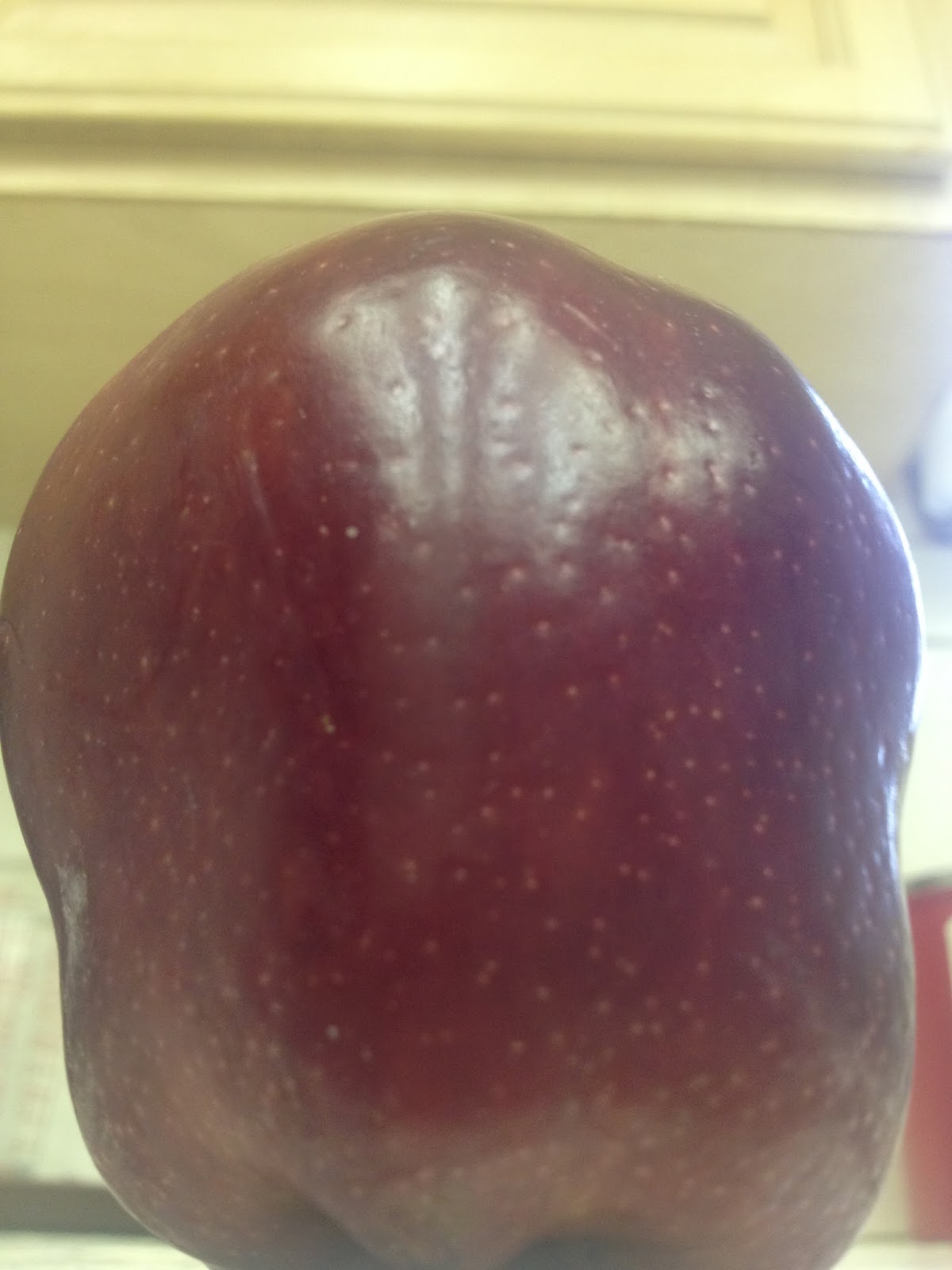
space & texture


1. I like photo number 3 best for the texture pics because it looks cool.
2. I like photo number 4 best for the space pics because it has trees.
Subscribe to:
Posts (Atom)